👋 Great designs start with great feedback. That’s what Workflow is built for. Start today.
Home - Design System - When To Use a Toggle Switch in UX and UI
When To Use a Toggle Switch in UX and UI
The toggle switch is one of the most commonly used UI and UX design components. There are several cases where the toggle switch is the element of your choice. Yet, in some cases, you’re better off using something else. Let’s look at those toggle switch best practices and when to use one.
- Updated on May 31, 2023
Table of Contents 💡
What is a toggle switch in UX?
In UX and UI, a toggle switch is an on-off switch with two states. That means you use a toggle switch to turn something on or off. Your users can pick only one of the two options at once.
In a way, the toggle switch shows many similarities with a question with two radio buttons as possible answers.
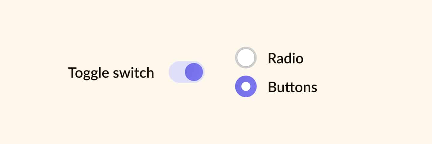
However, there’s a difference. Where radio buttons require a positive action (like submit or save, for example), it is a best practice for the toggle switch to take effect immediately.
Toggle switches have a real-life origin, just as most skeuomorphism-inspired elements in UI design do. If you look around, you will likely see that you use several toggle switches daily.
How about the light switches in your home or turning on a water boiler? These are all real-life toggle switches.
Toggle switch best practices
The toggle switch has several situations where it is best used. I will share with you when and when not to use the toggle switch.
However, keep in mind that this is the theory. As a UI and UX designer, it is up to you to determine if the theory fits your project.
Anyways. Here are the best practices and guidelines to remember when using this UI design system component.
Clear on-and-off state
Toggle switches are great when your users need to change or update preferences and settings with a clear on-and-off state.
Because of this, you must ensure your users understand the differences between states, as they are essential for how the rest of their experience will pan out. Just imagine what happens when a user mistakes the on-state for the off-state of an important setting.
Always use states that are in high contrast with each other. Use the accent color of your color palette for the on-state. It will most likely equal your primary action color. Your off-state should be the color you use for disabled UI elements.
Use labels
Always make sure that you use clear labels for your toggle switch. Depending on the use case, you can create either two exclusive states with each its own label or one label for the entire toggle switch.
In most cases, this is either on-off, yes-no, or enable-disable. For example, ‘enable dark mode’ or ‘show preview.’ Include a verb to make it actionable.
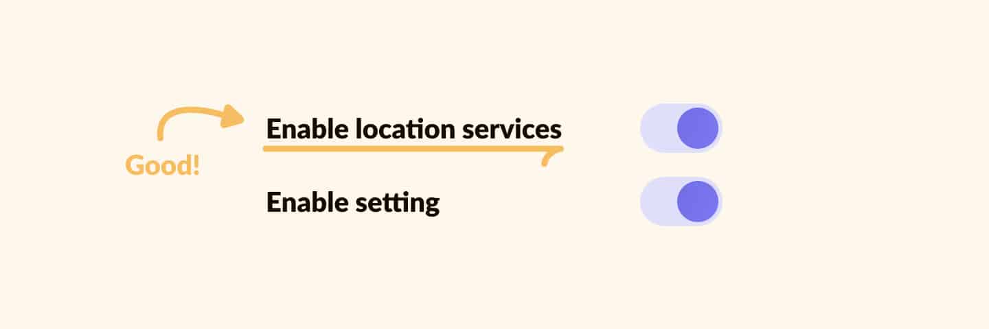
The image above shows examples of good and bad labels for the toggle switch. The good example is actionable and shows what you’re changing, whereas the bad example is unclear.
Follow internal and external guidelines
When designing components, you always have to follow internal guidelines like a design system or branding guide. For common components such as the toggle switch, external guidelines apply, too.
Examples of external guidelines are Google’s Material Design and Apple’s Human Interface Guidelines. Your users expect components to work a certain way, so following these guidelines helps to create more usable designs.
The Nielsen Norman Group also has a great page on toggle switch guidelines. This is a great place to continue reading if you want to know more about toggle switch best practices.
How to know if a toggle switch is on or off
You can see if a toggle switch is on or off by checking the position and color of the toggle. In Western culture, we read from left to right. That also applies to the toggle switch. If it is switched to the right, the switch is on.
Also, it is a best practice to have the on-state of a toggle switch use the accent color of your design.
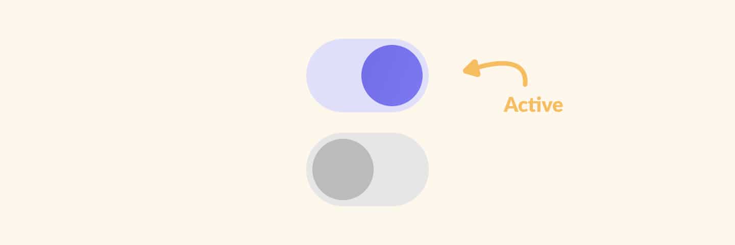
Take a look at the examples above. You’ll see that the switched-on toggle is moved to the right and uses our purple accent color. With all actionable elements on the website also using the purple accent color, it makes a lot of sense that this toggle switch is switched on.
Toggle switches vs. radio buttons
The main difference between a radio button and a toggle switch is your number of options. Toggle switches always have two options. Radio buttons can have two or more options.
In addition, a toggle switch is mainly used for settings you can enable and disable. Radio buttons are more common in forms where you have to decide between multiple options. For example, some forms use a radio button group to select the age group you belong to.
Toggle switch UI examples
I do not recommend designing toggle switch UI components that are too different from what is commonly known and seen as a toggle switch.
Users are used to a certain UI element and expect your website or product to work the same way. No need to redesign the wheel, or in this case, the toggle switch!
Yet, that doesn’t mean you have to use a standard component. Instead, you can put in some creativity to fit your branding guidelines. In other words, use the accent color of your company, but don’t change the expected component behavior.
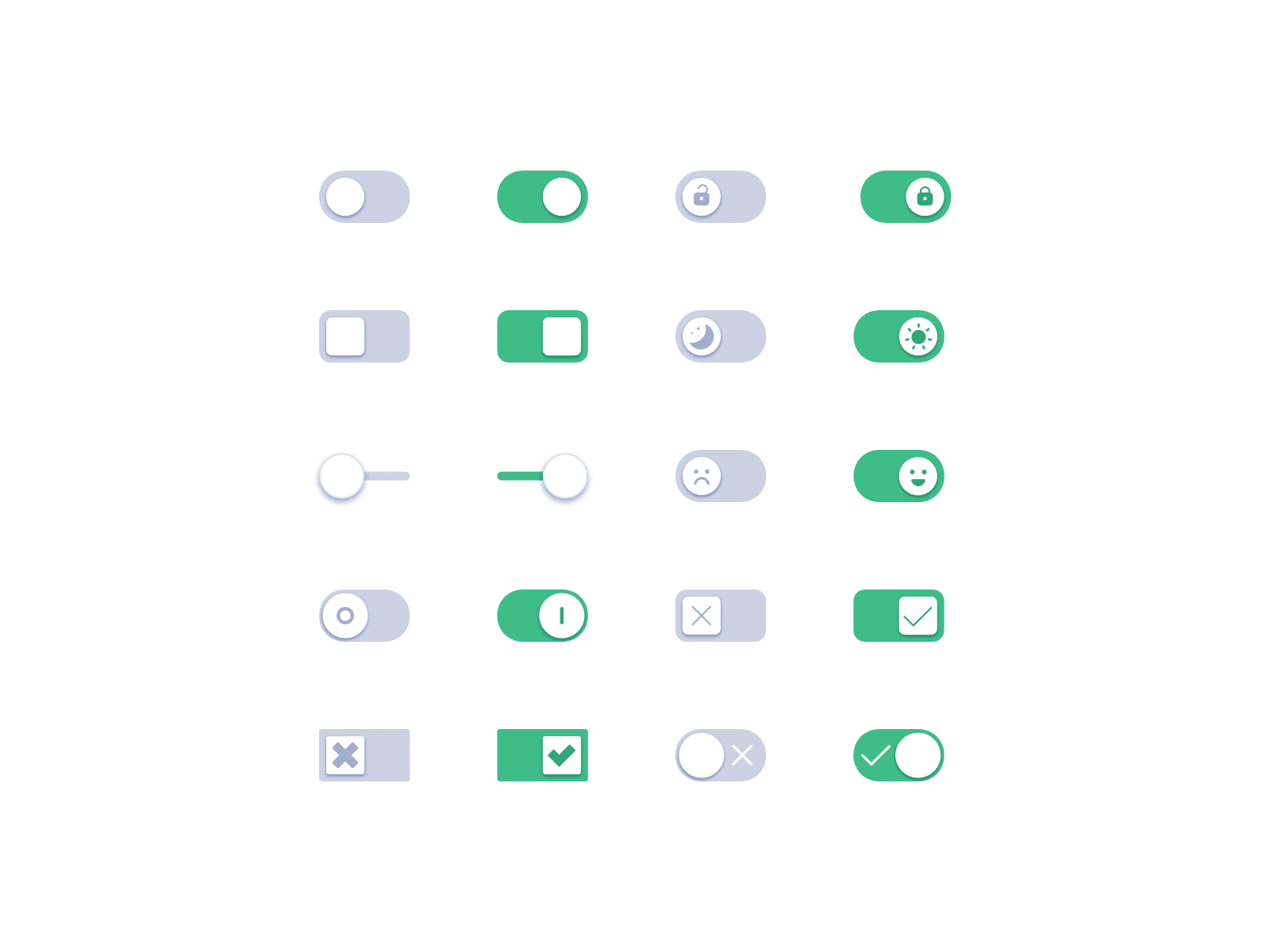
Take a look at some of the design examples I’ve found on Dribbble. They are simple yet very different compared to a default toggle switch design. These examples can inspire you to design great toggle switches for your next user interface design project.
Further reading
That’s about it for this component. Toggle switches have their uses, but only if you use them right. Alternatively, you could use radio buttons or checkboxes. Both have their use cases. So take a look if you want to learn more about that.
All of these components are part of the ultimate community-built design system I’m developing. You’ll find this component over there as well. Go take a look!
👋 Turn good design to great design, with feedback you actually need. Get it on Workflow.

About the author
Hi! I'm Nick Groeneveld, a senior designer from the Netherlands with experience in UX, visual design, and research. I'm a UX coach that supports other designers and have completed design projects in finance, tech, and the public sector.
☎️ Book a 1:1 mentor meeting or let's connect on LinkedIn and Twitter.


