Home - Design System - When to use tooltips in UX design
When to use tooltips in UX design
Tooltips are an important component used in your design system. They help users understand your design. But when to use tooltips in UI and UX design? Let’s work that out together.
- Updated on August 26, 2022
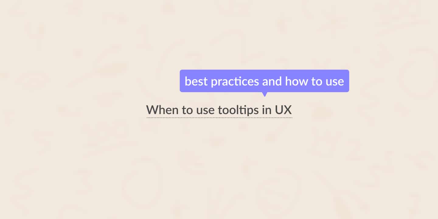
This post will take a closer look at the tooltip component, what it is, and when to use it in UI and UX design. Furthermore, I will explain best practices and share examples of when and how to use tooltips.
Table of Contents
When to use tooltips
You use tooltips when you need a little more information to explain something to your users.
Use tooltips only when you have to share a small piece of information. They shouldn’t handle crucial information about an action. You can use a tooltip when some of your users might need it.
In that case, you wouldn’t have to bother the other users with useless information. Don’t use a tooltip when the information is relevant to every user.
Let’s look at two use cases for when to use tooltips.
To explain an icon or visual
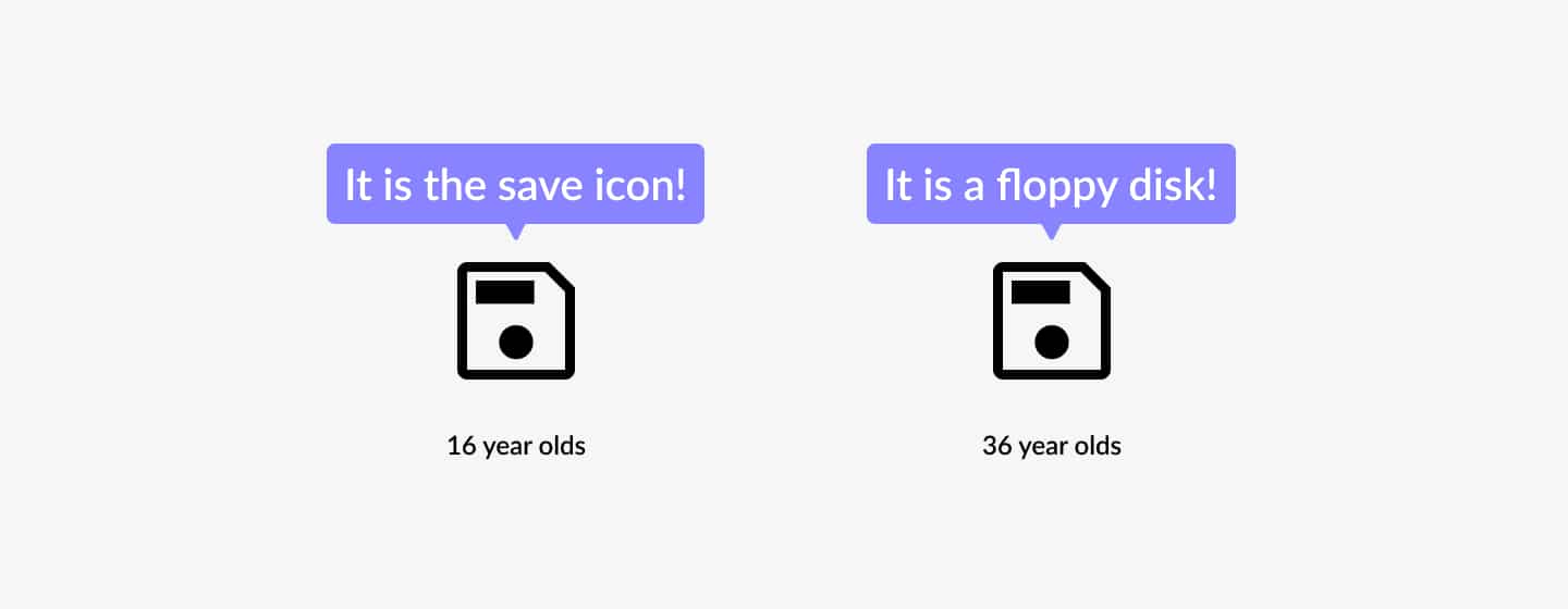
Let’s say you used icons in buttons instead of the text to save space. That’s not something I would recommend, but sometimes, it is the only thing you can do.
The challenge with icons is that they do not always represent what we want them to represent. For example, icons mean different things in different cultures.
In that case, using a tooltip to label the icon would make perfect sense.
To provide additional information
Sometimes you need to provide additional information to help your user understand a question.
You ask your users to provide a document number of an uncommon document, for example. Some users will know where to find this number immediately, while others will struggle to find it at all.
Using a tooltip here will help users understand where they can find the document number. The users that already know this will not be bothered by this info. It is a win-win.
What is a tooltip
Let’s take a closer look at what a tooltip is. It’ll help us better understand when and not to use a tooltip.
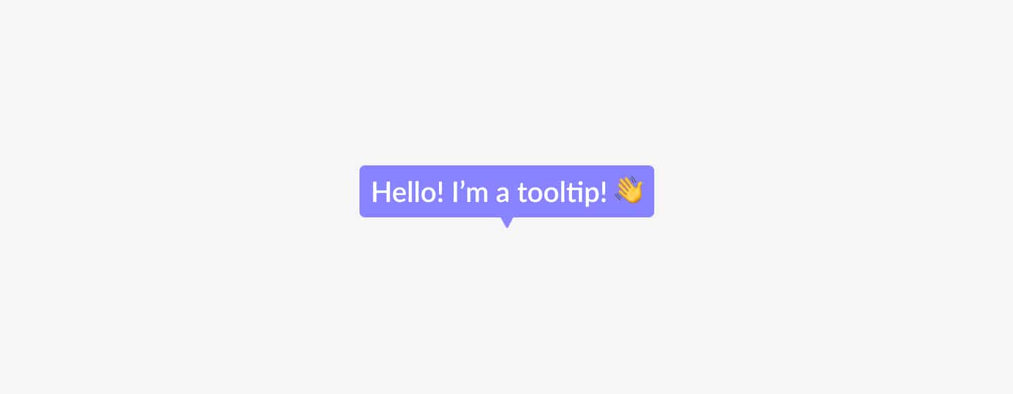
According to W3C, tooltips are popup messages typically triggered by moving a mouse over a component. Doing that causes a small popup window to appear with additional information about the component.
They provide additional information about actions on certain elements like links, buttons, images, and icons. If appropriately used, tooltips can be a powerful feature and excellent user experience booster.
Tooltips best practices
Now that we know when to use tooltips, it is time to move theory into practice. Therefore, I compiled a list of best practices to keep in mind when designing tooltips.
Show tooltips to your users
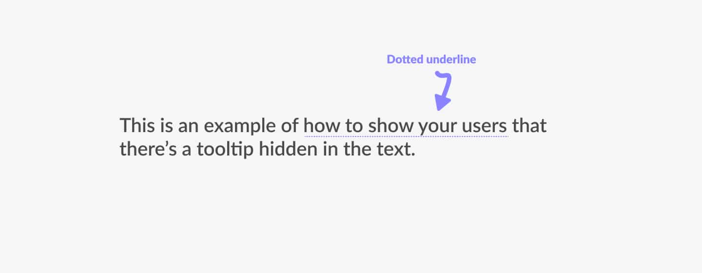
When you use tooltips in your design, ensure you’re consistent. Tooltips are difficult to find because they are often devoid of visual cues. People may never notice tooltips if you don’t give a clue they’re there.
One way to show tooltips to your users is to add a dotted line below elements.
Tooltips accessibility
When using tooltips in UI design, it is essential to make them accessible for all devices. That includes the mouse, keyboard, touch, and accessibility tools like the screen reader.
By making tooltips accessible, you will not only provide access to more users, but you will potentially increase your user base. So think of contrast and how every user can reach the tooltip—emphasis on ‘every.’
Position matters
Tooltips are useful. But they can cause problems when covering other parts of the page or content. Make sure that tooltips are positioned nicely on all screen sizes.
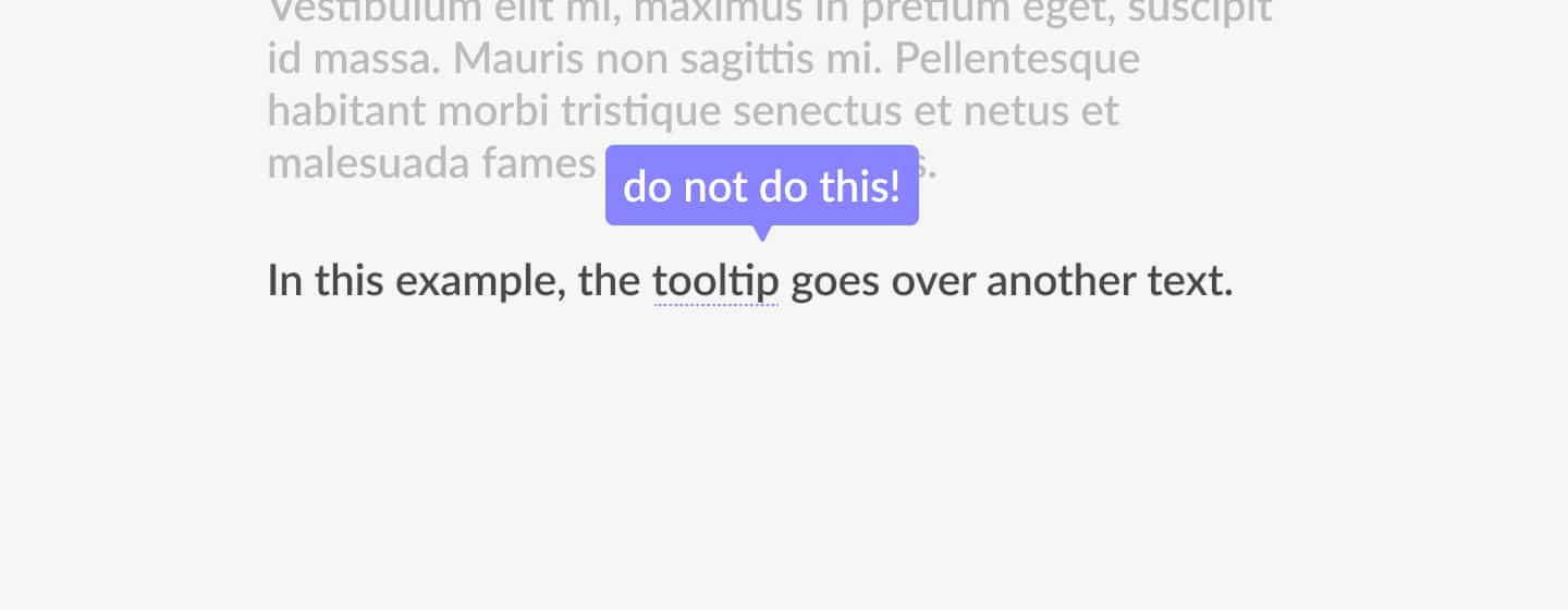
Tooltip examples
Now that we know a lot about tooltips, it is time to look at some examples. These will help you attach the theory and best practices discussed above to situations you can encounter as a designer.
Tread tooltips like comments: they assist in explaining things but aren’t the main attraction. Tooltips improve the user experience in a variety of situations. Let’s take a look at some tooltip examples.
Software onboarding
When you design software, you want your users to have the best possible experience. One of the tricks that creators use for that is the onboarding experience.
Onboarding is a step-by-step guide that helps users understand your products. It usually means introducing your main features to your users. Using tooltips during onboarding is an excellent example of how they help create a delightful user experience.
Text excerpt
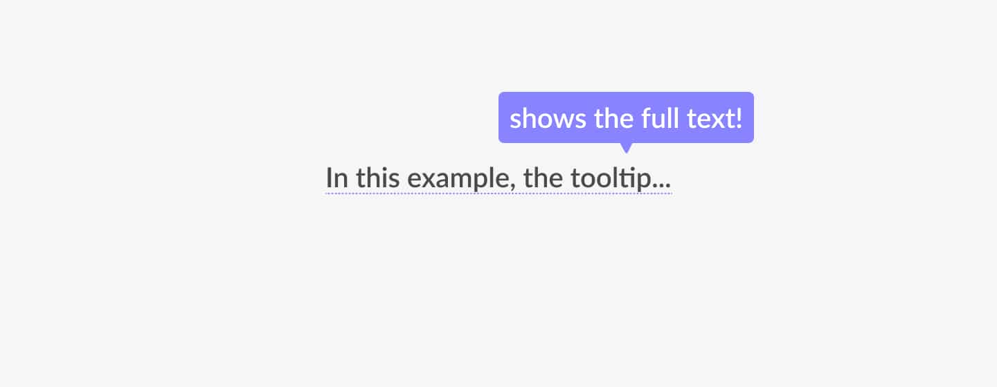
Up next is the text excerpt—another example of where a tooltip will be very useful.
You can use tooltips to display truncated text. The tooltip expands to reveal the entire text when the user hovers over the truncated text.
Unlabeled icons
As mentioned earlier, icons aren’t universally understood. Its meaning can change from culture to culture. They’re open to interpretation. To avoid unwanted situations, use tooltips for unlabeled icons.
Further reading
In this article, I answered two questions about tooltips. In addition, we also went through best practices and examples. Here’s what we now know.
- What a tooltip is.
- When to use tooltips.
Tooltips are a very powerful yet underused feature. You can use them in many ways, including onboarding, a text excerpt, and icons. Use them anywhere where you need to provide additional information to your users.
We also have written an article on when to use a toggle switch in UX and UI, explaining the use of the toggle switch. Together with tooltips, they are an essential part of any design system.

About the author
Hi! I'm Nick Groeneveld, a senior designer from the Netherlands with experience in UX, visual design, and research. I'm a UX coach that supports other designers and have completed design projects in finance, tech, and the public sector.
☎️ Book a 1:1 mentor meeting or let's connect on LinkedIn and Twitter.

