Home - Design System - How to use shadows in UI design
How to use shadows in UI design
Shadows are used in UI design every day. Popular variations and names include box-shadow, drop shadow, and many more. But how can you use shadows effectively when designing? That’s what this post is about. Welcome to the complete guide to mastering shadows in UI design.
- Updated on September 4, 2024
The main thing we’re going to do here is compare shadows in UI design to shadows in nature. Then, we’ll apply what we see to our UI design. As human beings, we’re very much used to how we see things in nature. That’s why mimicking what you see in nature is essential to creating fun and easy-to-use design.
Many design principles have found their way to the screen because of how they work best in nature. The most famous example is the golden ratio. Another example is how we like odd numbers better than even numbers. I mean, that’s odd, right?
Shadows in UI design will be no different. We’ll take a look at how nature does it, talk about some basic rules, and finish with a template for you to get started.
Let’s dive in!
Table of Contents
How shadows work in nature
In nature, you have three variables to keep in mind when working with shadows. First of all, we need to mention the light source. It could be the sun, the moon, or even just a reflecting surface. Up next is the object that’s receiving the light. This object casts its shadow on the third and final object. We’re talking about the shadow surface.
Let’s look at the essential guidelines and some examples of shadow in nature and apply this to UI design. You’ll notice how specific settings, like spread, blur, and offset, happen in nature as well. Once you see how shadows work in real life, adding them to Figma or Sketch will be as easy as can be.
We’ll start with the blur of shadow. The blur of your shadow increases once the light source moves closer to the object and the shadow surface. Blur also happens when the object itself moves away from the shadow surface.
Up next, we have the shadow spread. It is closely related to shadow blur in terms of behavior. If you move further away from the shadow surface, you will see that your shadow will increase in size. We call this the shadow spread. In UI design, we call this the shadow offset, but more on that later.
You’ll notice both the blur and spread effect when you look at your own shadow when you go outside. Initially, you’ll see that your shadow is very sharp because of the enormous distance between you and the sun. This changes when you jump or move away from the shadow surface in any other way. Both the spread and the blur of your shadow will increase.
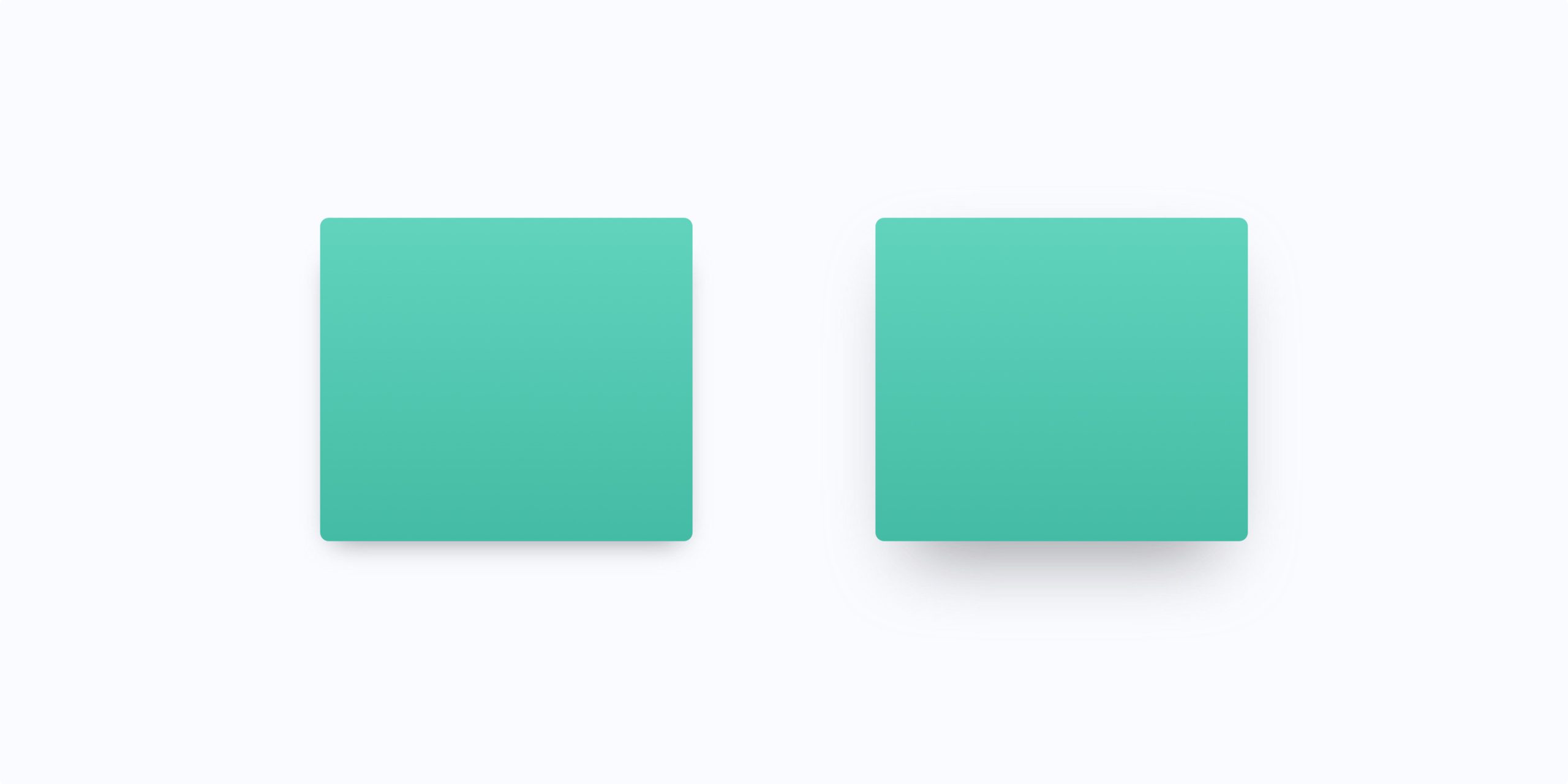
Finally, we have to talk about the color of shadows. Keep in mind that shadows darken the shadow surface. The object is blocking the light source, after all. You can check this by going outside on a sunny day and looking at your own shadow. You’ll see that the grass in your shadow is just slightly darker than the grass that isn’t in your shadow. However, the grass isn’t black.
How to use shadows in UI design
If you want to use shadows in UI and UX design, following the rules nature gives us is essential. Just as with hierarchy and gestalt guidelines in design, your brain is wired to see shadows in a certain way. Therefore, creating a UI design with realistic shadows is a must-have when designing something that works well without too many hiccups.
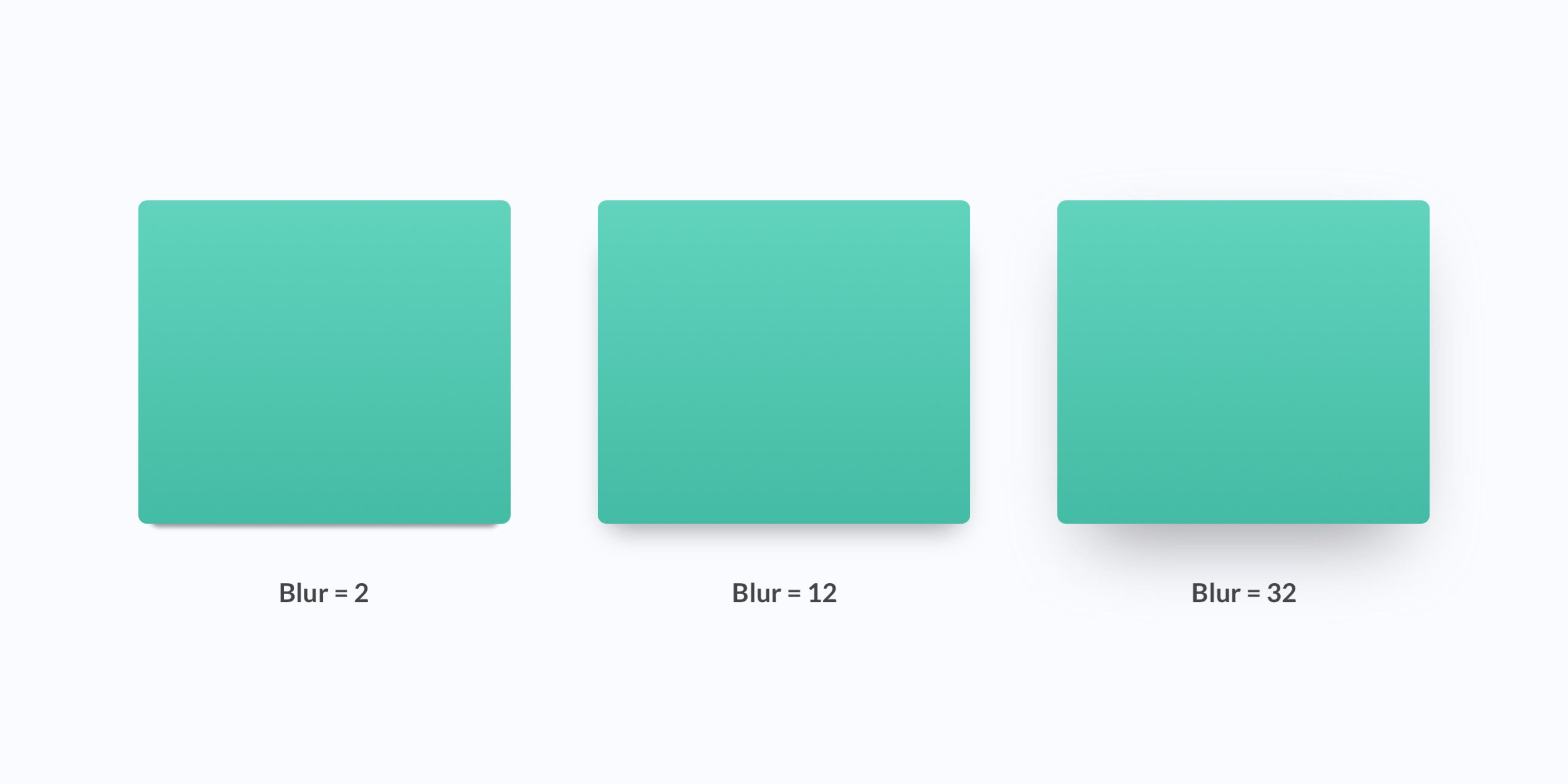
Blur
This is particularly useful when you stack multiple objects on top of each other. The highest most levitating object also has a shadow with the highest blur value. As you know, this is because higher objects are further away from the shadow surface. The distance between the object and the shadow surface increases the blur of your shadow.
Please note that we assume there’s no angle between the object, shadow surface, and light source. Otherwise, this would have a significant effect on the shadow shape, spread, and blur. It is very common in real life but hardly ever the case in UI design.
Offset
The x and y offset of your shadow depend on where you put the light source within your UI design. Depending on the height of your light source, the offset can increase and decrease. Generally, a light source that is more ‘on top’ of your UI elements means a smaller offset.
Color
In nature, shadows aren’t black. They darken the shadow surface. It means that the color of your UI design shadows isn’t black either. Your UI design shadows follow the colors of the other elements, like the shadow surface.
For your shadow colors in UI design, you can tweak the actual color (in Hex, HSB, HSL, or RGB) and the opacity of the shadow color. Keep the opacity low, ranging between 10% and 30% depending on the brightness of your shadow color. As an alternative, you can use a 100% opacity shade of grey for your shadows.

Notice how the actual shadow color is different between the middle and most right example, even though the same 50% opacity is used in both examples. This is how shadows in nature work as well.
How to use shadows in dark mode
Up next is dark mode. In UI design, dark mode is a very popular design trend in 2021. But how can you use shadows in dark mode UI designs? Luckily, most rules still apply, as we’ve described them above.
One thing to keep in mind is that the opacity of your shadow colors needs to be just a bit higher than when you’re designing shadows on a brighter background. It is because the background of your design is already dark. You’re going to make an even darker shadow, which means you will have to keep the contrast between the shadow and the background.
In some cases, your dark mode design is too dark for shadows. If that is the case, you can combine the shadows of your UI design with light source reflection. You can create lighter elements depending on how much these elements are elevated from the surface. Being closer to the light source means a brighter color.
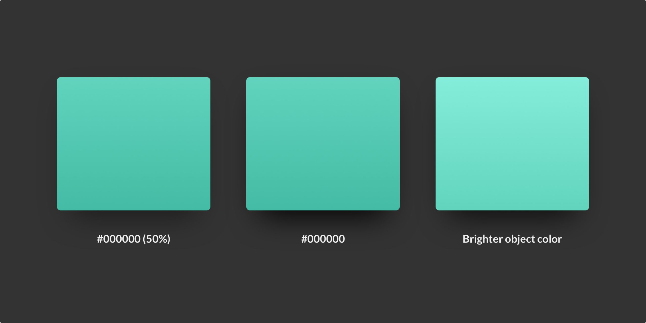
In the examples above, using shadows to show hierarchy is very difficult. Using more opacity helps a bit. The middle example looks like it is floating more than the left example. Yet, this will not be very accessible for someone with a visual impairment. However, if you combine the stronger shadow with a brighter object color, you’ll be able to visualise hierarchy better.
Setting up shadows in your UI design
That’s it for shadow theory and how to apply that theory in UI design. Now, it is time to look at how to set up a design project with great-looking shadows. Here are the steps you’ll need to take.
First, determine the location of your light source. Are you going to design using a ‘top-down light source,’ or do you position the light source more to the side? Make your decision at the start and be consistent throughout your entire design. For most designs, using a top-down light source is considered best practice.
Once you’ve determined the location of your light source, it is time to decide on the hierarchy of your UI design components. You can either go for a flat design or a ‘not flat’ design. Ask yourself the following questions.
- How does the hierarchy of my UI design elements impact the shadows I use?
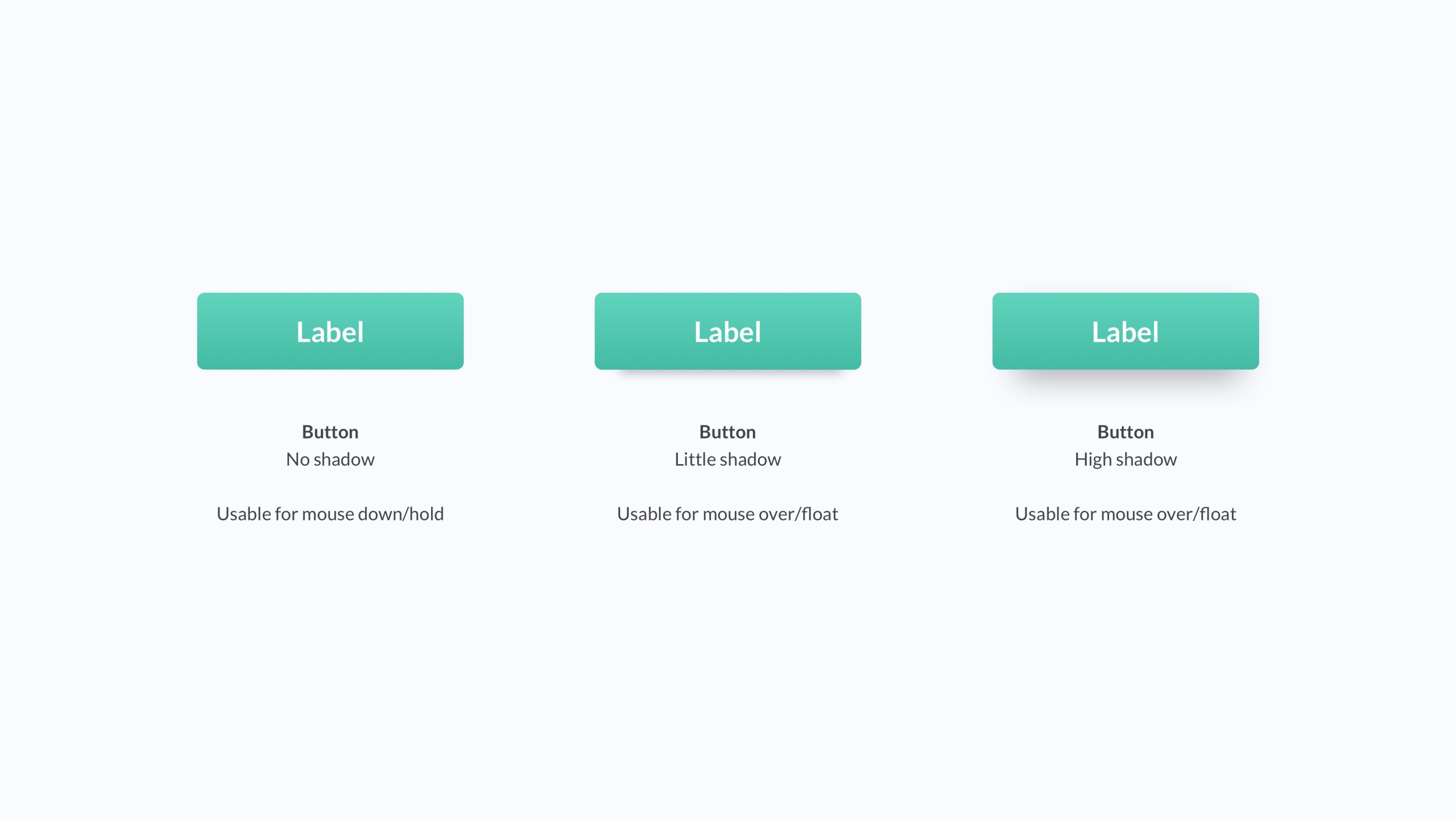
- Do clickable elements float by default, on hover, or not at all?
Asking yourself these questions helps you determine the specifications of your shadows. Once again, this is very important to consider before you start your project. It will save you a lot of time and effort down the road.
Finally, it is time to create your shadows. Our biggest tip here is to avoid using the shadow properties of elements in Sketch and Figma. Always create shadows yourself. You can do this by adding a layer below the element for which you want to create a shadow. This element will have a blur, and use your color of choice to fit the element in the layer above.
Further reading
Alright. That’s it for shadows in UI design. We’ve discussed shadows in nature, how that relates to your design work, and how to apply shadow theory in practice.
This post is one of the first in a series of design system posts. Stay up to date for more.

About the author
Hi! I'm Nick Groeneveld, a senior designer from the Netherlands with experience in UX, visual design, and research. I'm a UX coach that supports other designers and have completed design projects in finance, tech, and the public sector.
☎️ Book a 1:1 mentor meeting or let's connect on LinkedIn and Twitter.


